Problem/Justification
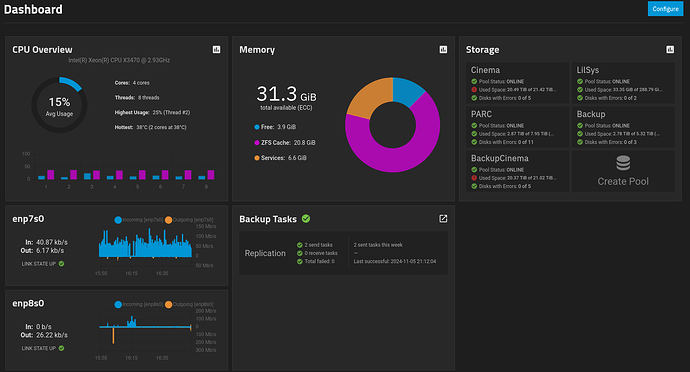
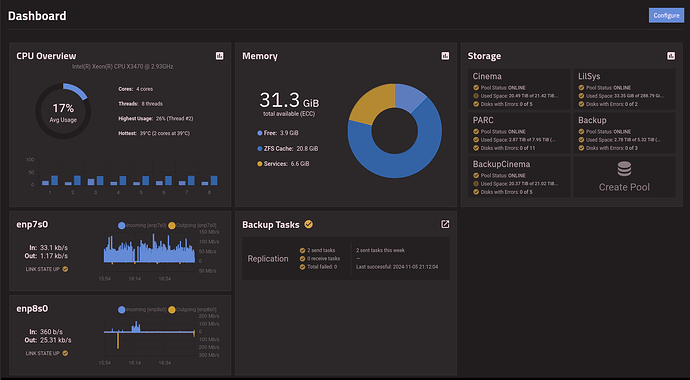
The dashboard widgets are less useful for me because I am red/green colorblind. In particular, the storage widget checkmarks are pretty much indistinguishable from !s. I also find the “Free” vs “ZFS cache” colors difficult to tell apart without looking very closely.
Screenshot of the dashboard:
Simulated red/green colorblindness (doesn’t look exactly the same to me, but hopefully it gets the idea across)
Impact
Some users may appreciate customizable colors, or at least having a few options.
It should have no impact on people who don’t use it.
User Story
A user has difficulty distinguishing the dashboard. They open the settings for the widget and select colors for each display item (or enable one of perhaps 3 colorblind-friendly color sets).

