…is so well hidden it took me substantial time to find it. Very bad UI design.
Was the documentation OK?
What would you change?
UI that requires reading documentation to do bacis things is a fail.
I expected delete button to be in the instance list, like in probably all lists in TrueNas. Consistency is a golden rule of UI.
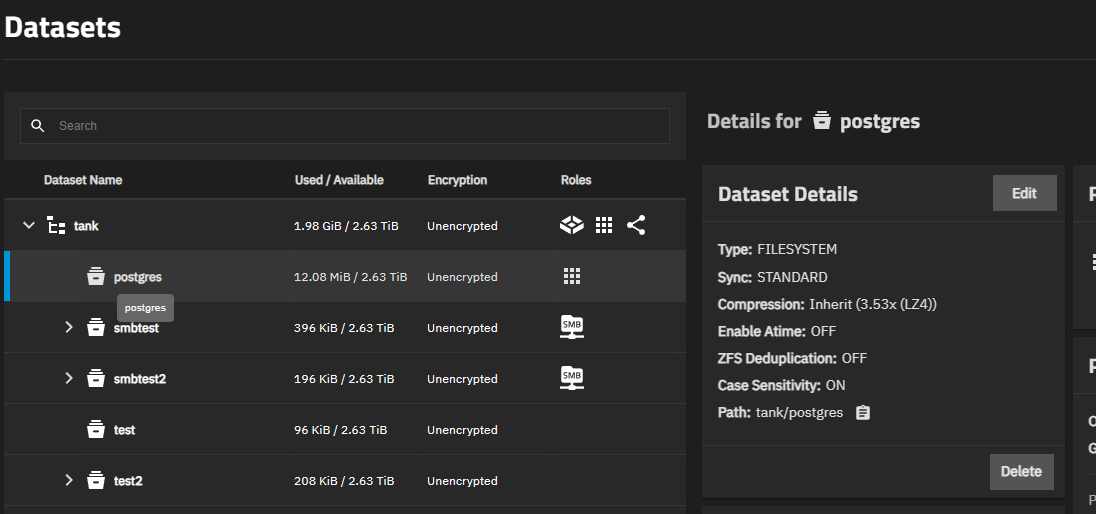
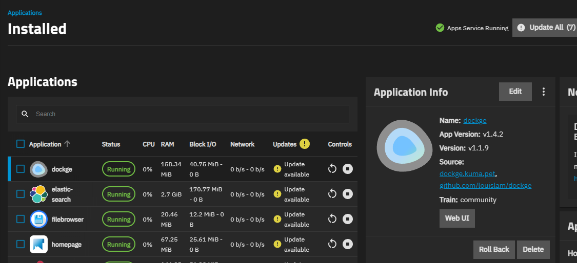
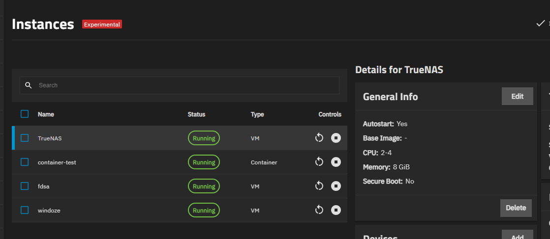
It is inconsistent with Datasets UI - icons in Datasets UI represent status and are not clickable. Icons in Instances and Apps represent actions and are clicable - but in both cases, delete action is missing (which is in turn inconsistent with Shares, Network and Certificates UI (and maybe some more that I’m not familiar with).
Yes, that is the case… one set of icons is “roles” and the other is “controls”
It is inconsistent, but useful…not sure we’d get any concensus on how to change.
1 Like
I think it might be usefull. I do not have a problem with inconsistency between lists. My problem is inconsistency within Instances/Apps list. There are buttons with actions on the list (Stop, Restart), but Delete is somewhere else, which, in my mind is bad UI.
I’ll check with engineering… we have historically made sure that “hard-to-reverse” actions are more difficult to do. Ease-of-shooting-yourself-in-the-foot is not a design goal.
I can understand that, but I think “Are you sure?” question is enough.