Problem/Justification
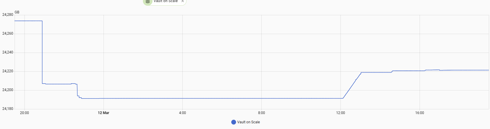
In Core there was the usage graphs of the ZFS system. These are missing in Scale
Impact
The ability to see on the system (with out relying on 3rd party software, e.g. HA Truenas integration) how quickly space is being consumed can alert people to an issue ahead of it being a critical one
Whist figures are great they don’t let humans visualise things a picture paints a thousand words
User Story
A Number of years ago I was managing a DAS system that had space issues - the management software provided a graph of space utilisation over time. I printed this out, used a ruler to draw a quick and dirty line extrapolating usage to 100% - then a vertical line down and using the scale gave an very rough estimate of how long we had till we ran out of space.
My Boss took this to the management meeting and instantly senior management saw the issue and timescale - no explanations needed
This prompted a company wide instruction to do housekeeping on the files stored