Problem/Justification
I came around some beautiful artworks on some banners on the TrueNAS Website.
Those banner should make their way the Login Screen customisation menu alongside a customisable welcome message or « Oops, you should not be there. This page is reserved to IT department ».
Impact
Beyond being purely cosmetic and improving the global experience, adding some visual customisation options could make more straightforward to differentiate multiple system at a glance at the login screen.
For instance system A vs system B, company A vs company B, company vs home or Home vs Friend’s home.
User Story
Advanced customisation like upload a custom picture could be reserved to paid enterprise customers.
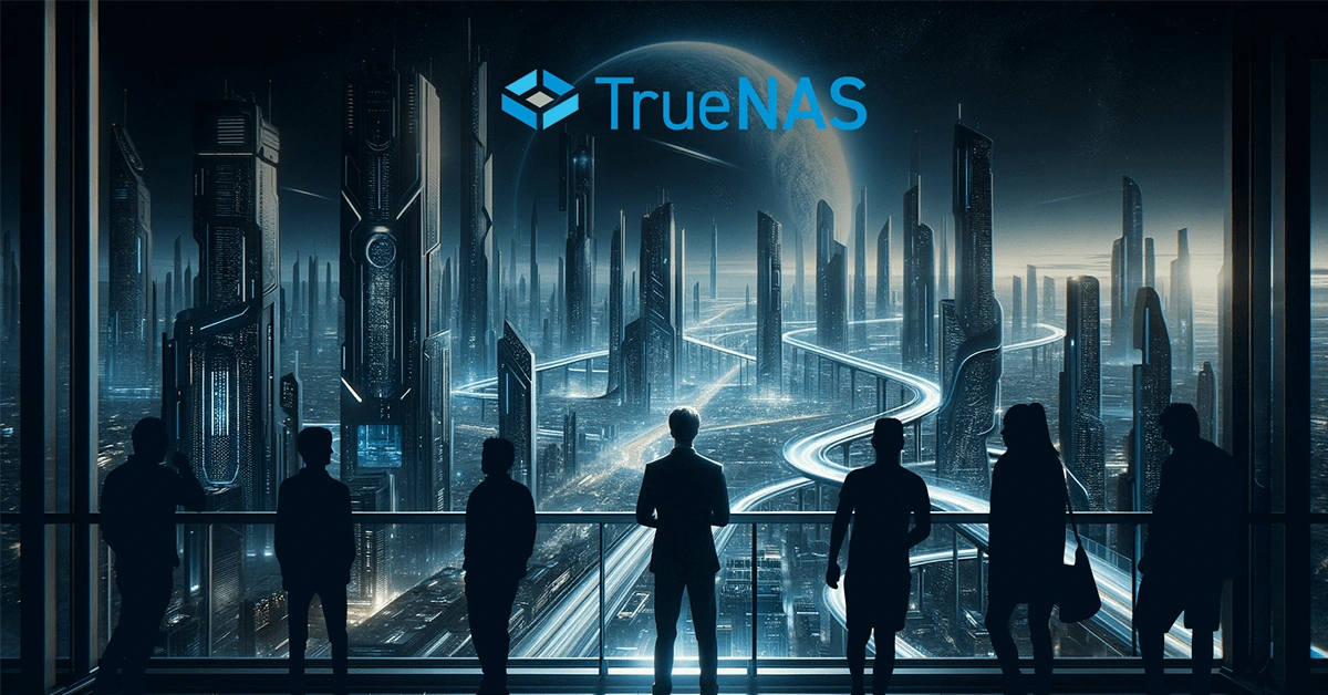
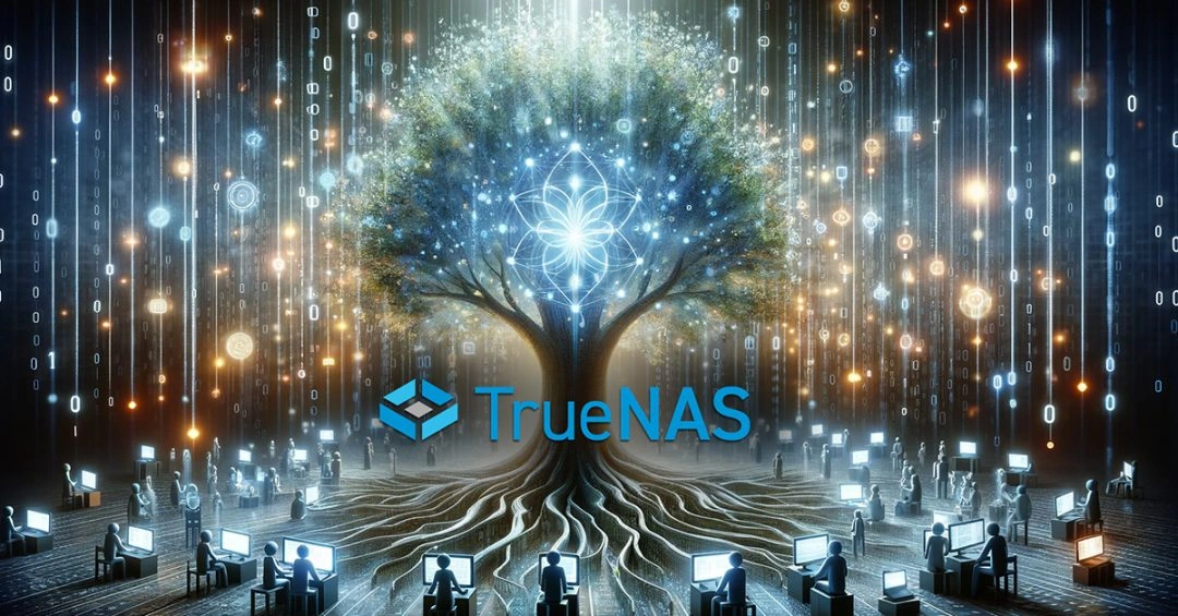
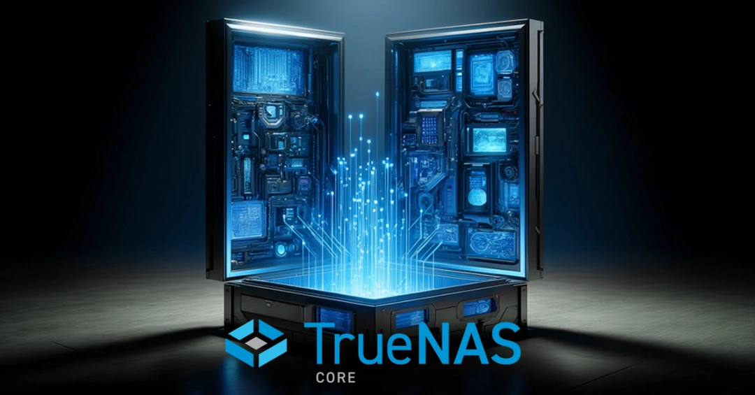
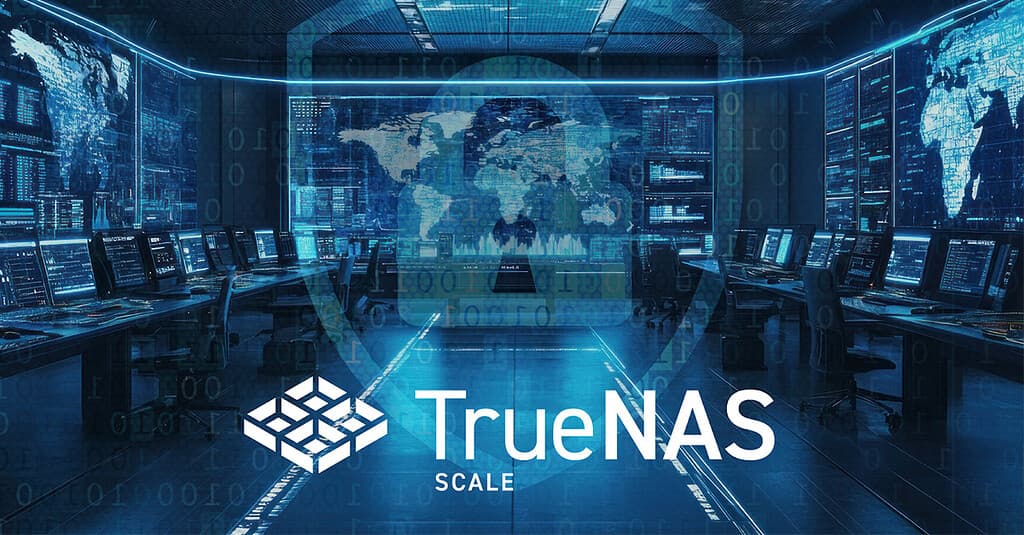
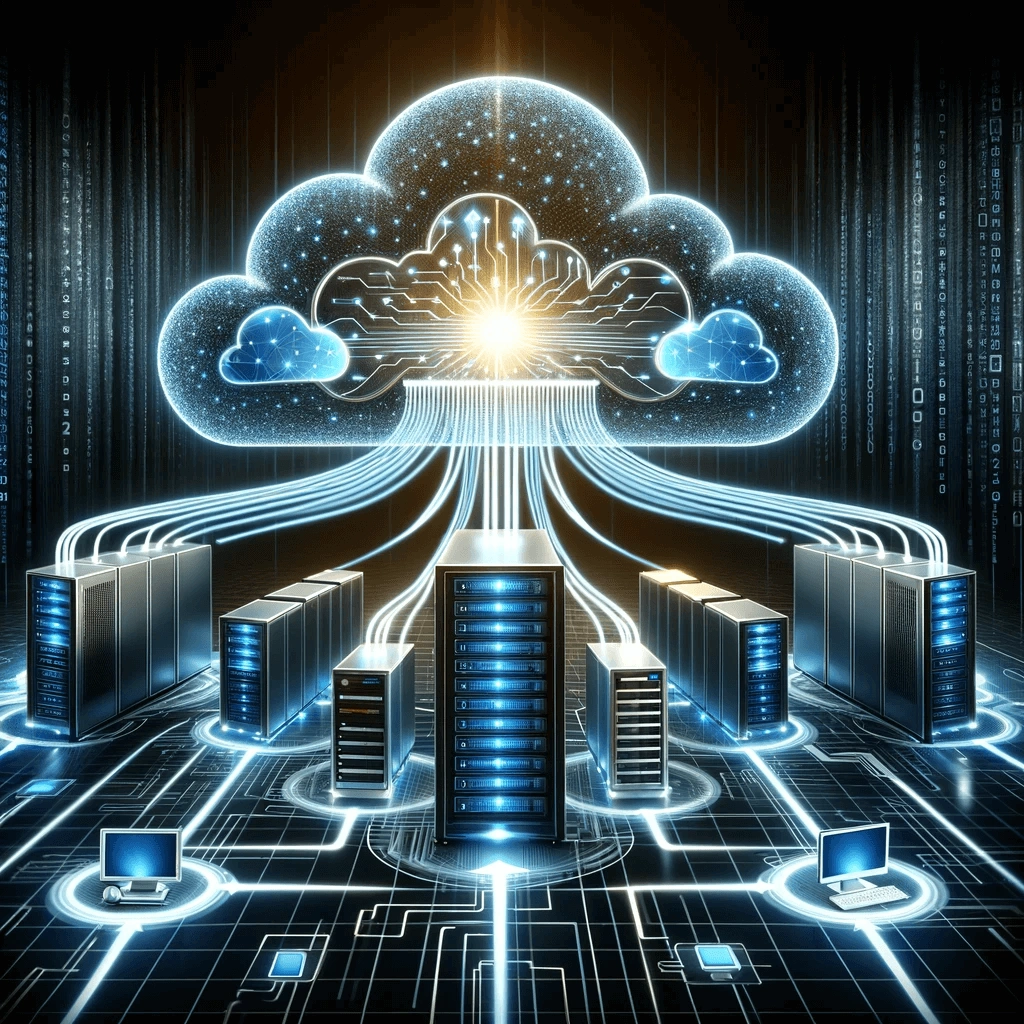
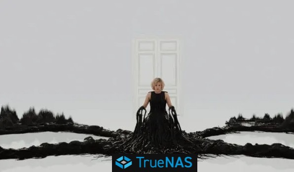
Here are some example
of some images I found on TrueNAS website. Other pictures could be added.
I agree that personal preference is important, I only added those pictures for illustration purpose because this iX System already has the copyright on this artwork on its website.
The library of such pictures for customisation, should indeed contain much more items.
Correction :
Oops, I read preference instead of presence.
Yes, visual presence won’t make my system work better but will surely make me want to look at it more enthusiasm !
Sure, currently the themes (which, sadly, aren’t user-editable) only affect UI colors. But the concept is there already, so expanding it shouldn’t be a heavy lift.