SUGGESTION: Don't use "folder" icons for datasets

The SCALE GUI for pools and datasets shouldn’t use “folder” icons to represent datasets. This can cause confusion for users who are not as familiar with ZFS. Especially since there are other parts of the GUI (such as SMB shares) that do present actual plain folders.

Vote on this ticket if you agree.

They got it right with zvols (as seen in the screenshot), but not with datasets.

3 Likes

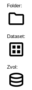
The icon you suggest looks very much like the one for a zvol. I actually like both being distinct and in my book a folder for a dataset and a stack of platters for a zvol make perfect sense.

3 Likes

I realized it afterwards, so I added a comment in the ticket.

One of nicer things we’ve added recently to SCALE is different icons for datasets and directories in path selectors:

4 Likes

I don’t mind folders, but I did a quick search of the material icons and this is what is literally called a “dataset”.

image

2 Likes

LET’S GOOOOOOOOOOOOO!!! @kris is on fire today!!! :fire: :man_superhero:

:partying_face: :partying_face: :trophy:

EDIT: What I’m trying to say is I like the icon @kris discovered.

EDIT 2: Creating a new sockpuppet account on this forum so that I can give his post another “like”.

EDIT 3: Does anyone know how to bypass a perma ban for violating a forum’s TOS by creating multiple accounts?

EDIT 4: How come it doesn’t show my post as “edited”, when in fact I edited it multiple times?

There is a grace period on edits made within the first 5 minutes. After that they show up as properly flagged edits. So you can correct typos and such right away. I like it, need all the help I can get :wink:

3 Likes

Suggested icons for the GUI, consistent across all pages:


Folder:
folder

Dataset:
dataset

Zvol:
zvol

If you disagree with this, then it means you hate puppies and sunny days. Sorry. I don’t make the rules.

7 Likes

image
image

We should encourage folks to post options since its so subjective.

2 Likes

Won’t make it into CORE, because changing the icons might break some workflow for enterprise customers. :stuck_out_tongue:

4 Likes

Right? Then we’d have to update pictures on all the docs, <makes further excuses noises here> :joy:

4 Likes

The ones posted by @winnielinnie are perfect. Simple, in accordance with established standards, and - most of all - easily distinguishable!

3 Likes

Having our UX folks take a look at this thread now. We’ll review the proposed and see if we can work that in. Thanks for the good suggestion @winnielinnie and pointing out an area where we need some better consistency.

2 Likes

Tell them to look at it with the “Light” forum theme. :sweat_smile:

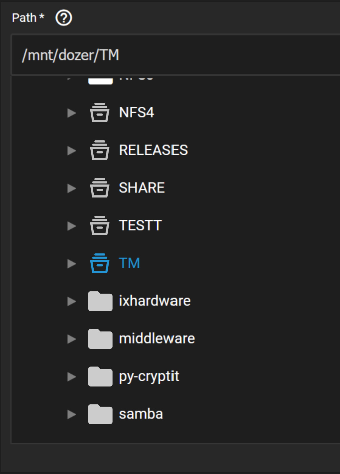
I just now realized how bad some of my posts appear, since my theme on this forum is set to “Light”. But the default theme is “Dark” and really messes up the appearance of dark icons. (Had I known, I would have filled them in with “white”.)


Here’s how it looks when I’m logged into these forums:

icons-on-light-background

I hate dogs in any shape, size and age. And, when not chasing eclipses, I much prefer somewhat overcast to boringly blue skies for the sake of landscape photography.

But I still voted for the ticket. Go figure. :face_with_monocle:

1 Like

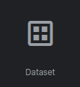
100% agree with improving dataset representation with a better icon. However, the visual cue that the suggest “Dataset” icon provides is a little vague. In isolation it looks like a window which may have other connotations.

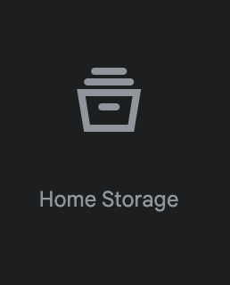
How would everybody feel about using the “Home Storage” material icon?
The metaphor is a filing cabinet which implies that it contains both files and folders. We think this would be more appropriate.

image

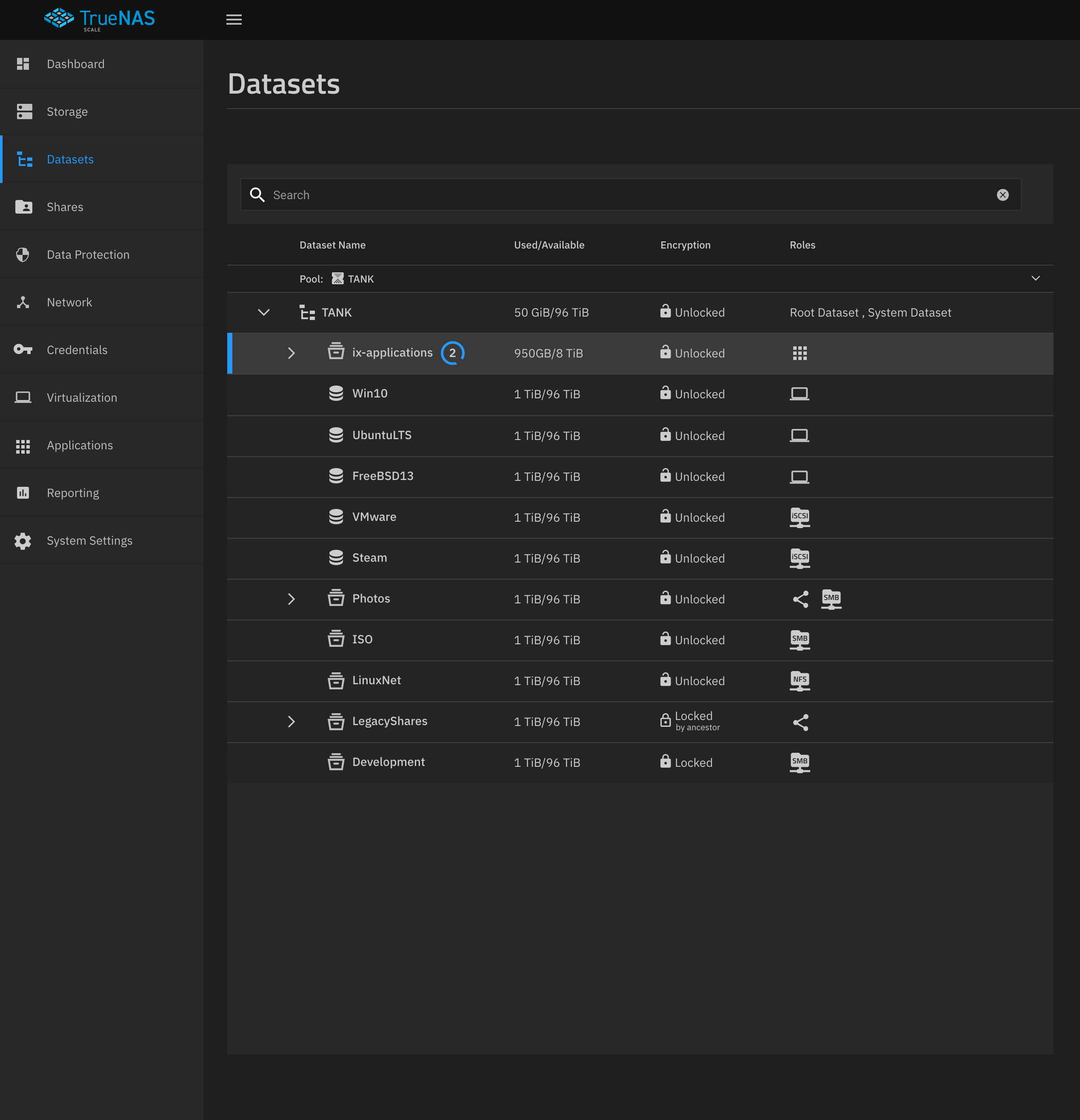
I updated an old Bluefin mockup with this icon to show what it might look like in context

6 Likes

Tell us more about how much you hate puppies. :rage:


In a serious note, I actually like your icon the most! You get my vote!
:partying_face: :clap:

1 Like

To confirm, this would also apply to other parts in the GUI, such as with an SMB share location selector, etc?

To confirm, this would also apply to other parts in the GUI, such as with an SMB share location selector, etc?

Correct. It should look something like this…

2 Likes

I’m not sure that smb shares shouldn’t be obvious, since they are often a less easy thing to configure, or tend to be troublesome for those who set them up. I say this only that if they were unique it would be easier to know if something were amiss.

I’m not sure what the best icon or variation for it would be though.