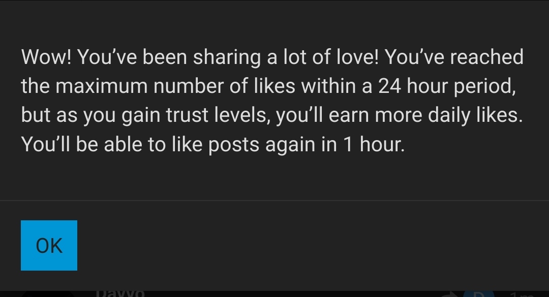
Thank you Kris, but… the heck??
3 Likes
Woah you broke it! ![]() Hadn’t seen that limit before. We’ll have to review those likes per trust level, but you are bumped up in the meantime.
Hadn’t seen that limit before. We’ll have to review those likes per trust level, but you are bumped up in the meantime.
2 Likes
Careful with these limits… Newbies have to be kept in check ![]()
3 Likes
If possible, a flowchart feature/plugin for Discourse?
Even though this can be done with outside apps, and downloaded to attach as images, being able to create a simple flowchart directly inside a post can really help out for visual learners. Especially considering the questions and solutions involving ZFS, networing, storage, NAS, snapshots, backups, etc.
EDIT: This guy gets it. ![]()
1 Like
graph TD;
  A --> B;
Like this?
Docs and Info Here:
3 Likes
That can definitely work. Reading up on it now.
flowchart LR;

A[Winnie] -->B2{Reading} --> C[Understands]
A[Winnie] -->B1{No Reading} -->D[Doesn't Understand]
The editing is a bit weird at times, since it seems to move your text cursor around when you want to backspace or delete.
I think it’s possible to get a hang of. ![]()
4 Likes
@kris: It’s better than nothing, but there are some usability issues.
Namely, the “auto-sizing” needlessly creates vertical scrollbars, when it’s clear that the entire chart can fit without “cropping” it from the top/bottom. (I’m trying to find out why it does that.)
See this post for an illustration.
There’s also this annoying quirk where it “intelligently” tries to move your text cursor around as you’re typing. Unlike other “dumb” text fields, it feels like the mermaid plugin wants to help you out… a bit too much.
EDIT: Another issue is when someone tries to “quote” your post that contains a chart. ![]()
1 Like
I wonder if the ‘vertical scrollbar’ issue could be modified by CSS. If the containing box is not large enough to fit its content, you can choose to have automatic scrollbars or, I’ve now discovered, a lot more, including scroll snap:
That is to say then, that this particular aspect of how the plugin works could be cured or implies that the CSS the devs chose is not the best.
1 Like
@tigersharke: If you look at my post again (with the flowcharts), you’ll see they appear fine now.
I had to use a “trick” to get around this issue.
To borrow from elsewhere:
I realized it kept reverting my “height” parameter the moment I entered a new one. The only way to “trick it” is to hit “Reply” REALLY FAST before it can undo the change.
So for instance, it INSISTS on making the height “349,auto”. If I write “500,auto”, it will revert it to “349,auto” in the blink of an eye, and hence, the cropping/scrollbar issue reemerges.
Is that a “smart” feature that can be toggled or disabled in the plugin?
EDIT: I figured it out. It’s the realtime “preview” window on the right side. If you disable it, it’s much easier to write in mermaid syntax. There is no sudden jerking of the text cursor or reverting your text.
1 Like
@kris Indeed scrolling doesn’t feel natural for me. Old forum had similar UI to STH forum and both were great and easy to use. This one look similar to Level1Tech forum with same scrolling. Searching between tabs is challenging.
But most importantly font seems very small.
on 3440x1440 i have to zoom on chrome to have the same font size as in old forum.
1 Like
2 Likes
Thanks it helped. But whole forum is still narrower. On old forum i can utilize more space in browser. When i have the same on new one i have bars on left and right. (3440x1440 and tab uses half of the screen)
3 Likes
…which is because it’s the same forum software. I personally don’t really like pagination in topics or topic lists, but apparently some folks do.
1 Like
yeah… I would suspect that this is due to the theme(s) or discourse devs seeming to favor mobile or to create for it first. This is the same for me but possibly worse as my monitor is a 4k.
1 Like
Can a close box be added to the “we moved” blurb on the bottom of the old forum?
I still do a lot of reading of posts there… and on mobile… and I can only see 1 line now!
Yeah. If I scroll I get to make use of 40% of my screen. Very annoying when all the content is still at the old place…
3 Likes
I am not sure this can be done, but as a temporary fix, if the browser addon ‘nuke anything’ can be added, this should solve it by being able to remove it for that period of access to the site.
Another option is yet another browser addon, which is stylus, and then create a CSS rule to do “display: none;” for a selector that covers those. This would work for every login after the style is created and enabled.
2 Likes
Was just going to mention that.
1 Like
Same forum software, XenForo, though STH runs it closer to factory defaults.
I think it’s an optical illusion. I brought this up earlier and was told that, objectively, the font size was the same.
1 Like
I’m adding my grievance about the “narrow” reading area.
It hampers the ability to quickly view a “code” snippet/section, as many commands (and outputs) require some length of characters.
I often find myself clicking the “expand” button to view the coded section in a temporary pop-over window.
Is there no way, theme or otherwise, to increase the width of the center reading pane?
5 Likes
I’ll add one more complaint here on the narrow width center “reading pane”.
3 Likes